

.png)
At Whispli, we know the true power of a whistleblowing solution lies not in collecting reports, but in converting them into meaningful, actionable insights.
That’s exactly what our analytics module provides: a clear, intuitive way to visualize data with charts, dashboards, and consolidated reports, easy to share and act on across teams and stakeholders.
Our latest release makes the module smarter and more intuitive, offering new visualizations and enhanced support for custom data, delivering the clarity and precision you need to act with confidence.
Unlock the full potential of your custom data
Until now, the use of custom fields—such as form questions or workflow steps—within reporting forms was limited, preventing you from fully leveraging your data.
Custom fields can now be leveraged as seamlessly as standard ones (date, status, etc.) to build charts. And when the same question appears in several forms, responses are automatically grouped under one attribute, delivering a consolidated view with no manual effort required.

Finally, questions can be renamed with clear, consistent labels (for example, “In which country did the incident occur?” can become “Incident country”).
These improvements deliver analyses that are clearer, more consistent, and above all, more actionable. With added granularity, precision, and comparability, you unlock reporting that’s more reliable and more valuable to your teams.
Simpler, more powerful configuration
Creating charts and tables is at the core of Whispli’s analytics module, enabling every organisation to tailor its analysis to its specific needs. To make this even easier in daily use, the configuration process has been completely redesigned.
The chart builder now lets you cross two dimensions within a single visualisation. For example, you can analyse the number of reports by country and break them down by incident type.
Dashboards are simpler to set up, tailored to your specific needs, and easy to share with the right audiences. Harmonised labels and consolidated fields make your analyses more readable and eliminate confusion.
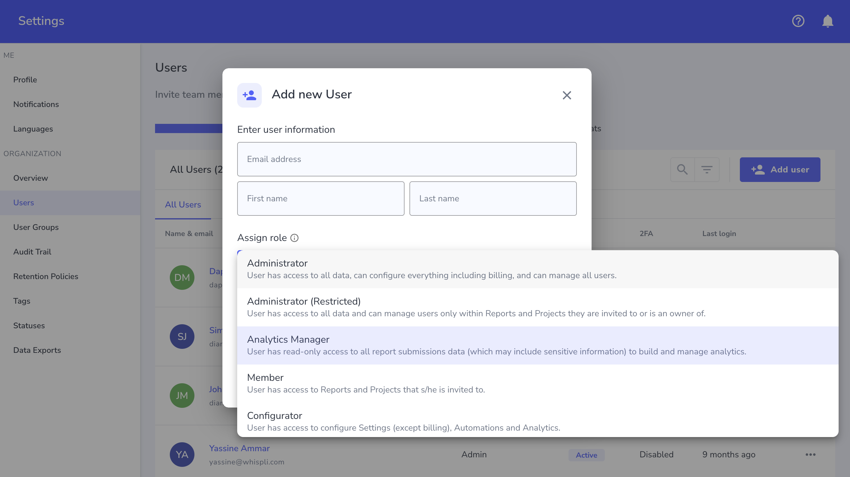
Finally, the new Analytics Manager role enables your data or compliance teams to build and share rich dashboards without accessing sensitive or personal data.
New ways to visualise your data
Visualisations are essential for tracking reports, comparing incident types, and measuring resolution times.
Visualisation formats have been expanded, now offering even more possibilities:
- Stacked column charts: compare multiple categories side by side while showing each segment’s contribution to the bigger picture.
- Tables without aggregation: each data row is displayed as is, without grouping. This gives you a complete view of all reports and enables detailed exports tailored to stakeholder needs.
These new visualisations offer greater flexibility for exploring your data and communicating results tailored to your specific needs.
With these enhancements, Whispli makes it easier to leverage your reports and expands your analytical capabilities. Whether you’re tracking trends, comparing incident types, or meeting compliance obligations, you now have a powerful management tool to strengthen governance and improve the performance of your whistleblowing program.
👉 Contact your Customer Success Manager or request a demo to explore the new features of Whispli’s analytics module.


%201.avif)
%201%20(2).avif)
%201%20(1).avif)